How to trade with Bar Chart
Are you looking for meaning or an explanation of a bar chart? Many events can happen to security in just one day of trading. Still, fortunately the bar chart exists to guide us in summarizing all the important information that we need to know in bar chart trading.
A bar chart or a bar graph exhibits data by using rectangular bars at lengths or heights proportional to the values they represent. Bar charts can be horizontal or vertical; however, they are usually vertical.
What are Bar Charts Used For?
The advantage of bar charts is that economic or market information can be effortlessly understood with a simple look at the graph. Examples are corporate revenues, sales values, or share price changes. This makes bar charts a great basis for increased technical analysis, which will, later on, help you plot your own strategy as an investor.
Bar charts are the most utilized technical analysis tool there is. In case you are ever searching for the key figures for security in one day, the bar chart is probably going to be the primary thing you see. Bar charts also show up in newspaper analysis and incorporate reports, where they can assist readers in visualizing changes and patterns briefly without overwhelming them with never-ending figures.
How to Read Stock Bar Charts
The most significant thing to know about bar charts is how to read them. Bar graphs or charts present what is called “categorical data” – a gathering of data into discrete groups. For example, days of the week, months of the year, age groups, and so on. In a column bar chart, the categories appear along the horizontal axis; and the height of the bar corresponds to the value of each category – for instance, the value of shares, net revenue, total sales, or whatever else is being recorded.
Bar charts indicating security prices

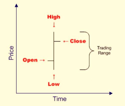
As an investor, the kind of bar chart you will probably be most interested in is that used to show security prices or costs. In these charts, each vertical bar conveys four key pieces of data about a single day’s trading in security very simply and effectively:
- The top part of the bar indicates the security’s highest price for the day
- The bottom part of the bar indicates the security’s lowest price for the day
- A horizontal mark on the left of the bar indicates the security’s opening price
- A horizontal mark on the right of the bar indicates its closing price
These charts are very useful for identifying trends and patterns, and their main characteristic is that they place more visual accentuation on the highs and lows of a security on a specific day than on their opening and closing prices.
Bar Charts Trading
Since a bar chart shows the open, high, low, and close price for every period, there is a ton of data that traders and investors can use on a bar chart.
Long vertical bars indicate that there was a major price difference between the high and low of the period. That implies that the volatility increased during that period. When a bar has very small vertical bars, it implies that there was little volatility.
It takes a lot of practice and training to get used to reading a bar chart, especially when the price is moving rapidly. Remember, the open is consistently on the left, and close consistently shows up on the right. It is just like how you read: the right to left because the open always precedes before the close.
Other chart types include candlestick, Heikin Ashi, and Renko charts.
Read more:


