How to read the 3 main types of Forex charts
There are three main types of Forex charts. In this article, we are going to talk about the way they work, what you should know about charts, and how do they look like. Enjoy!
Line Charts
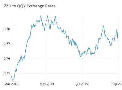
Line charts have a line drawn between closing prices. They connect each closing price and form a picture of a mountain. They are the best option for beginning trades for monitoring the overall price movement of a currency pair for a specified period of time. On the picture below, you can see an example of line charts:

Bar Charts
This kind of Forex charts is a bit more compound than the previous one. Bar charts are often called OHCL charts due to what they show. These are four key points:
- Opening prices;
- Highs;
- Closing prices;
- Lows.
As you can see in the screenshot below, the lowest part of a bar shows the minimum price at which trade had occurred at a specified time period. The top part shows the highest price paid for a pair.
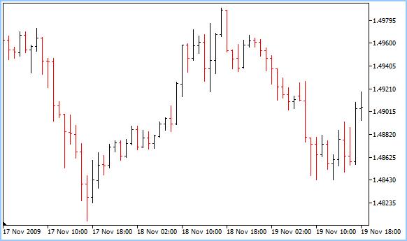
We can conclude that the vertical bar is an indicator of the trading range of a currency pair at a specified time period.
There also are horizontal slashes on each bar. When they are on the left side, they represent the opening price. If located on the right side, then they show the closing price.
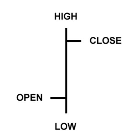
A single bar represents a time segment. This can be a day, a week, a month, or a year. That is why it is important to know what time segment is being shown on a chart. If you get it wrong, your trades might bring you some losses.
Candlesticks Charts
По сути, свечи представляют те же детали, что и гистограммы. Разница основана на том, как выглядят графики Форекс. Вы можете быть заинтересованы в этой статье: Руководство по анализу свечей для начинающих .
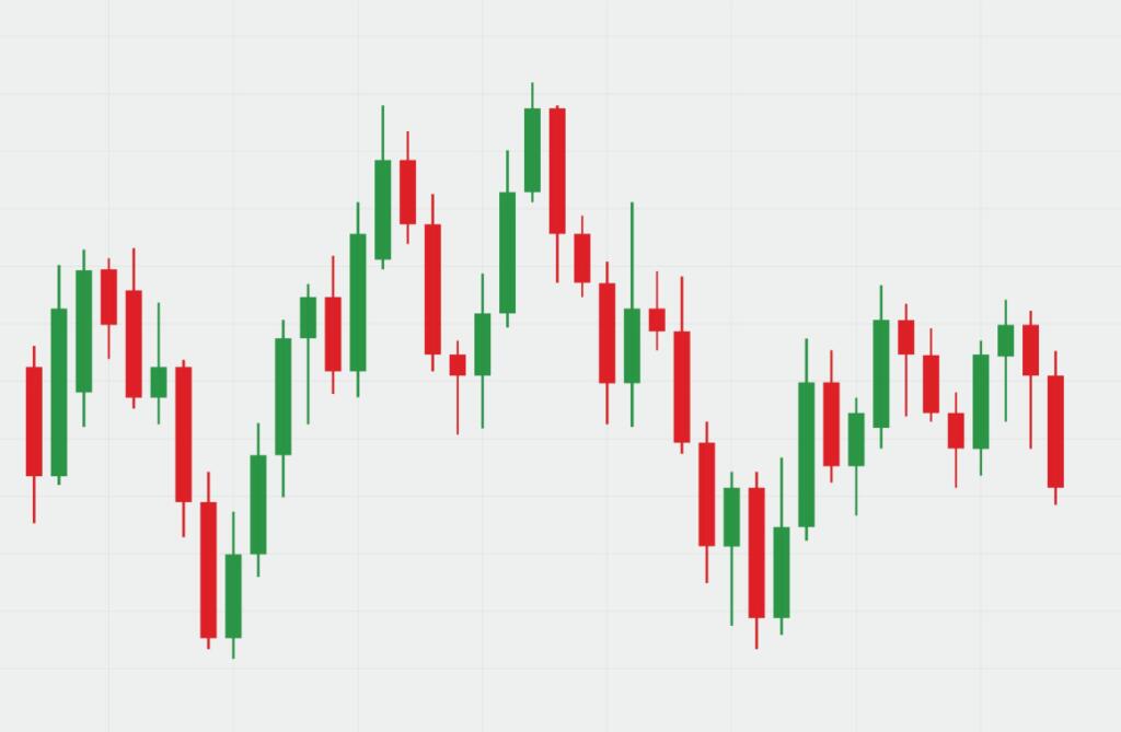
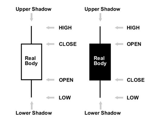
The body of a candlestick shows the price range. In monochrome candlesticks, a black body shows that the pair closed at a lower price than the one at which it had opened. That is how it looks like. Besides, you can also learn the anatomy of a candlestick from this example.
Read more on the topic: Top 4 best Candlestick patterns for trading in 2020.
This version is not very popular. Most traders prefer using green and red candlesticks with the same meaning. They look better and are easier to work with. Have a look and see for yourself!
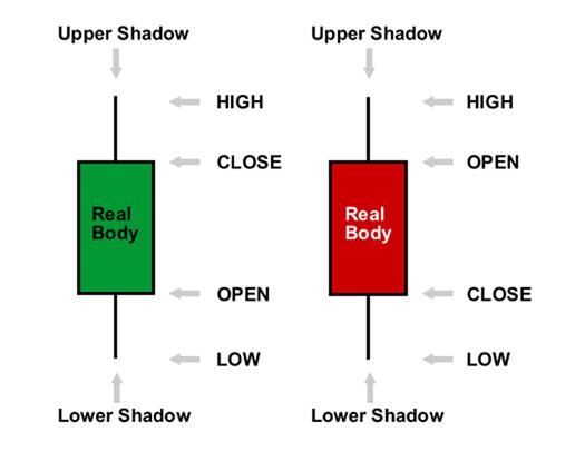
Candlestick charts are only used as a visual improvement. Nothing new is given: the information is completely the same as in bar charts. Some advantages of the candlestick Forex charts include:
- An easier way to interpret;
- Working with them is quicker because you can immediately understand what is going on by one glance;
- Candlestick patterns are easy to remember due to their creative names;
- These charts are good assistance to identify reversals.
If you are a beginner, we recommend using either line charts or candlestick charts. This will make market analysis much easier. Now you know how to read charts, so what will be your choice?


